Device Emulation Headless Browser API: A Practical Guide
September 13, 2026
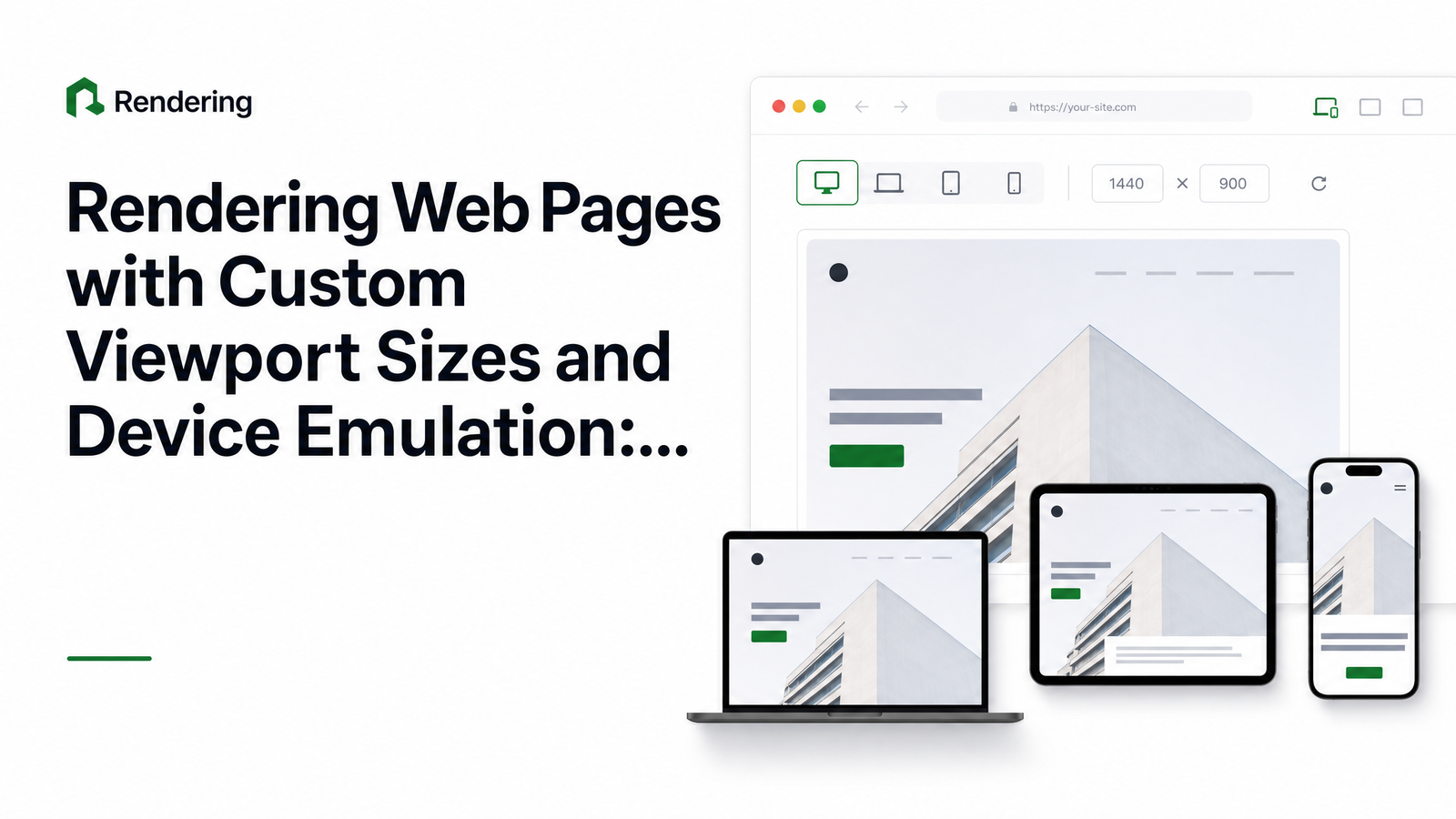
Why Viewport and Device Parameters Matter for API-Based Rendering
A headless browser renders whatever viewport and device profile it's told to. Hit a URL with default settings and you get a desktop-sized render every time, regardless of whether your users are on a phone, a tablet, or a high-DPI laptop. That's fine until someone asks why the screenshot doesn't match their iPhone, or a visual regression check misses a layout break that only shows up at 375px wide.
Screenshots, PDFs, and extracted HTML all depend on the same rendering context — window size, pixel density, touch capability, orientation. If you don't set those explicitly, you're rendering an accidental default, not a deliberate one. Responsive layout testing at the API level means treating viewport and device emulation as first-class request parameters, not an afterthought.
The Core Parameters: Viewport vs. Full Device Emulation
Six fields do almost all the work, and they map directly to what Puppeteer and Playwright expose through page.setViewport() and page.emulate():
- width / height — the viewport dimensions in CSS pixels, what your media queries and CSS breakpoints actually respond to.
- deviceScaleFactor — the pixel ratio between the CSS viewport and the physical output. A value of 2 or 3 simulates Retina/high-DPI displays.
- isMobile — tells the rendering engine to apply mobile-specific layout behavior, including how the viewport meta tag is interpreted.
- hasTouch — enables touch event support, which matters for pages that branch behavior based on touch capability detection.
- isLandscape — swaps width/height orientation without manually inverting the numbers.
Setting just width and height gives you a raw viewport — useful for basic responsive testing, but it doesn't tell the page it's on a phone. Full device emulation combines viewport with isMobile, hasTouch, and typically a mobile user agent string, so the page renders as it would on real hardware, not just at a smaller size. This distinction is where a lot of "why doesn't this match my phone" bugs come from. For the deeper mechanics of how user agent strings affect what a server sends back, see our user agent explainer.
Calling Browsevra's API with Custom Viewport and Device Settings
The pattern Puppeteer scripts wrap in browser.launch() and page.emulate() becomes a single stateless request. Here's a headless browser API request example for a mobile-emulated screenshot:
POST /v1/screenshot
{
  "url": "https://example.com",
  "viewport": {
    "width": 390,
    "height": 844,
    "deviceScaleFactor": 3,
    "isMobile": true,
    "hasTouch": true,
    "isLandscape": false
  }
}
That same viewport object carries over unchanged whether you're calling the screenshot endpoint, the PDF endpoint, or the HTML/structured-data endpoint — no new parameter set per output type. To render a page with a custom viewport for desktop responsive testing instead, drop isMobile and hasTouch and just set the dimensions:
{
  "url": "https://example.com",
  "viewport": { "width": 1440, "height": 900, "deviceScaleFactor": 1 }
}
No browser binary to install, no memory leaks from long-running Chromium processes, no infra to patch. If you're maintaining Puppeteer or Playwright scripts and want to move this logic to request-level calls, the Puppeteer to API migration runbook walks through translating setViewport() and page.emulate() calls directly into these request bodies. Full field names and schema live in the API docs.
Picking Viewports That Actually Matter (Not Just Device Lists)
Copy-pasting a list of "iPhone X, iPad, Galaxy S20" dimensions feels thorough but goes stale fast — new devices ship, old ones disappear from your analytics, and none of it tells you where your layout actually breaks. A more durable approach: open your CSS, find the actual breakpoints your stylesheets define, then test just outside each one (a few pixels below and above) where reflow bugs hide.
As a starting baseline for 2026, most teams get solid coverage testing four ranges: a small mobile width (360–390px), a large phone/small tablet width (768px), a tablet/landscape width (1024px), and a standard desktop width (1440px). If your site uses container queries rather than pure CSS breakpoints, add a width where a specific component's container crosses its own boundary — container queries respond to component width, not viewport width, so a page-level breakpoint list can miss those changes entirely.
Common Pitfalls: DPR Mismatches, Stale Layouts, and Window vs. Viewport Confusion
The single most common complaint — "my screenshot is blurry" or "it's twice the size I expected" — comes down to deviceScaleFactor. A value of 1 renders at native CSS pixel dimensions; a value of 2 or 3 multiplies the output resolution while the layout still reflows against the CSS viewport size. Set it too high for your intended use and you get an oversized file; set it to 1 when you meant to simulate Retina and you get a flat, soft-looking image next to real device screenshots.
A second class of bugs comes from confusing viewport size with window/browser size. In a real browser, window chrome (tabs, scrollbars, address bar) eats into the space available to the page, so the viewport is smaller than the window. A headless browser API sidesteps most of this by letting you set the viewport directly, but if your local Puppeteer scripts were setting window size instead of viewport size, your renders and your API calls won't match until both are aligned.
Finally, watch for stale layouts: some pages only re-run JavaScript-driven layout logic on an actual resize event, not simply because they were rendered at a different width from page load. If your page relies on window resize listeners rather than pure CSS media queries, make sure the parameter reaches the browser at render time — set the viewport before navigation, not after.
Automating a Multi-Viewport Check in CI
One-off manual checks don't scale, and they don't catch regressions introduced by the fifteenth deploy this month. Instead, define a small matrix of viewport/device configs — say, mobile portrait, tablet, and desktop — and loop it against every URL you care about as part of your CI pipeline:
for viewport in mobile tablet desktop:
    POST /v1/screenshot { url, viewport }
    compare against baseline image
Each request is stateless, so parallelizing the matrix across a build step is straightforward — no shared browser instance to coordinate. This is the backbone of API-driven visual regression testing: instead of maintaining a headless browser cluster for CI, you send the same viewport parameters you'd use locally as request bodies, store the outputs, and diff them against baselines on every merge. For full-page captures where lazy-loaded images or sticky headers distort the diff, pair this with the guidance in Full Page Screenshot API: Fixing Lazy Load & Sticky Headers.
Frequently Asked Questions
What's the difference between setting a viewport size and emulating a full device?
Setting a viewport only changes width and height — the CSS layout reflows, but the page still looks like a resized desktop browser. Full device emulation adds isMobile, hasTouch, and typically a mobile user agent, so the page behaves as it would on real hardware, including how it interprets the viewport meta tag and touch-based interactions.
How do I capture how a page looks on an iPhone without owning one?
Send a request with viewport dimensions matching the phone's CSS viewport (e.g., 390×844), set deviceScaleFactor to 3 for Retina resolution, and set isMobile and hasTouch to true. This reproduces both the layout and the rendering fidelity of the physical device without needing the hardware.
Why does my screenshot look blurry or the wrong size when I change deviceScaleFactor?
deviceScaleFactor multiplies the output resolution relative to the CSS viewport, so a mismatch between the value you set and the resolution you expect causes blurry or oversized images. Use 1 for standard-density output and 2–3 to match Retina/high-DPI displays, and keep width/height fixed so only the pixel density changes.
What viewport widths should I actually test for responsive design in 2026?
Start with four ranges: 360–390px for mobile, 768px for tablet/small breakpoints, 1024px for tablet-landscape or narrow desktop, and 1440px for standard desktop. Adjust these based on where your own CSS breakpoints and container queries actually trigger reflow, rather than copying a generic device list.
Can I emulate touch events and mobile user agents at the same time as a custom viewport?
Yes — hasTouch, isMobile, and a custom width/height are independent fields that combine in a single request. Setting all of them together is what distinguishes true device emulation from a plain resized viewport.
How many device/viewport combinations should I run per page in a CI visual regression check?
Three configurations — mobile portrait, tablet, and desktop — cover most layout regressions without slowing down a build pipeline. Add a fourth only if your product has a specific breakpoint or container query behavior that those three don't exercise.
Ready to see how your own layout holds up? Grab an API key and run your URL through the docs' quickstart at browsevra, and if you're planning to run a full breakpoint matrix on every deploy, check pricing to size usage for your CI volume.